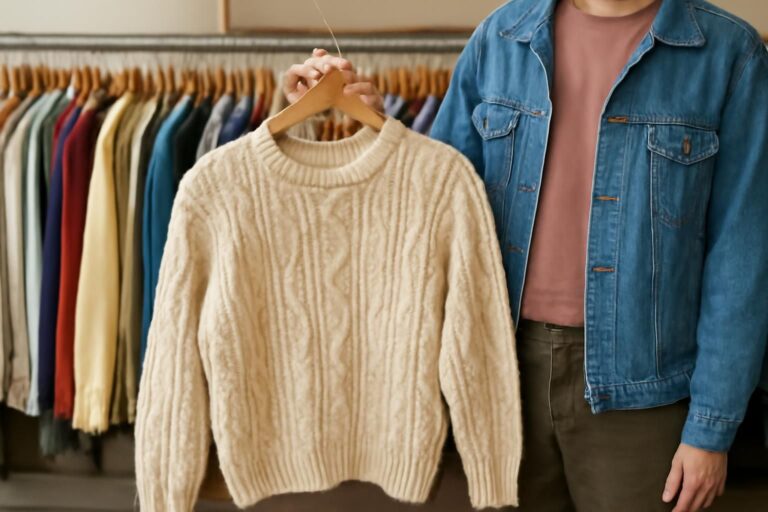
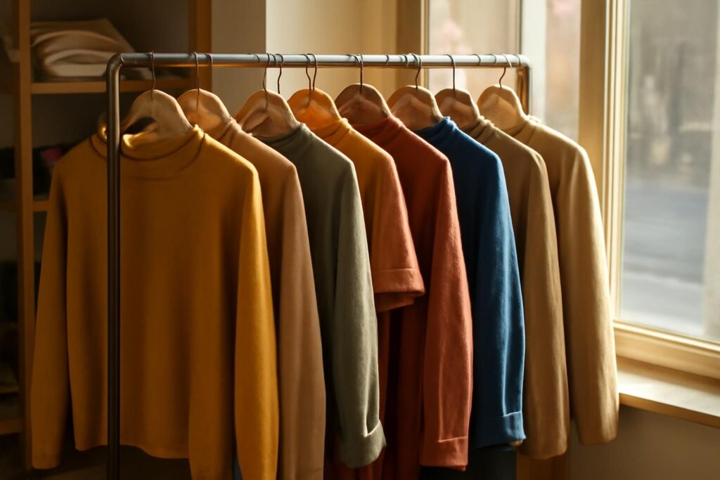
Most outfits that look “put together” follow a handful of simple color ideas. Learn those ideas once and you can match almost anything in your closet, thrifted or new.
Good color combinations for clothes are less about talent and more about a few repeatable patterns. Painters, interior designers and graphic designers have used the same color-wheel logic for generations, and it translates neatly to getting dressed. This hub explains that logic in plain terms: the two color wheels and which one to use, the five classic color schemes, warm versus cool colors, how neutrals work, and a proportion guideline borrowed from interior design. At the end there is a guide to every color we cover, from brown to beige, each with its own page of outfit pairings. If you are building a wardrobe on a budget, pair this with our roundup of Best Affordable Fashion Brands (2026) so the colors you choose are easy to find at a fair price.
One thing to keep in mind before we start: color “rules” are guidelines, not laws. They explain why certain combinations feel balanced, and they give you a starting point when you are stuck. Once you understand them, you can break them on purpose.
Start with the color wheel (and say which one)
The color wheel arranges hues in a circle so you can see how they relate. The catch is that there are two common wheels, and they do not agree on which colors sit opposite each other.
- The traditional RYB wheel (red, yellow, blue) is the painters’ wheel. Its primaries are red, yellow and blue, and its classic opposite pairs are red and green, yellow and purple, and blue and orange.
- The RGB wheel (red, green, blue) is the light and screen model used by monitors and phones. Its opposite pairs are red and cyan, green and magenta, and blue and yellow.
For clothing, the traditional RYB wheel is the one most style and art guides use, and it is the one we use across this site unless we say otherwise. So when you read that green sits opposite red, that is on the traditional color wheel. On a screen-based RGB wheel, red’s opposite would be cyan instead. Neither wheel is wrong; they describe different systems (pigment versus light). For outfits made of dyed fabric, the painters’ wheel is the more practical reference.
Primary, secondary and tertiary colors
On the RYB wheel, the primary colors (red, yellow, blue) cannot be mixed from other colors. Secondary colors come from mixing two primaries: orange is red plus yellow, green is yellow plus blue, and purple is blue plus red. Tertiary colors come from mixing a primary with the secondary next to it, which gives you in-between hues such as red-orange, yellow-green, blue-green and red-violet.
Tints, shades and tones
Very few clothes come in pure, fully saturated hues. Most are variations, and those variations have names:
- Tints add white, so they are lighter. Pink is a tint of red; baby blue is a tint of blue.
- Shades add black, so they are darker. Navy is a dark blue; burgundy is a dark red or red-purple.
- Tones add gray, so they are more muted. Sage, dusty rose and slate blue are tones.
This matters because a pairing that looks loud in pure hues can look calm in muted tones. Red and green in bright primary versions can feel festive; burgundy and olive, which are a darker red and a dark yellowish green, sit in the same opposite positions but read as quiet and autumnal. When a combination feels like too much, try a shade or a tone of one of the colors before giving up on it.
The five color schemes that work in outfits
Color schemes are named relationships between positions on the wheel. Design tools such as Adobe Color’s free color-wheel tool offer them as presets, which makes it a handy place to experiment before you get dressed. Here is what each scheme means and how it looks on a body.
1. Complementary: opposites for contrast
Complementary colors sit directly opposite each other on the wheel. Design sources describe the effect as strong contrast and visual energy. On the traditional RYB wheel the three classic complementary pairs are red and green, yellow and purple, and blue and orange.
Outfit example: a navy blazer over a white tee with a rust or camel scarf. Navy is a dark blue, and rust and camel read as dark or muted oranges, so the scarf sits opposite the blazer on the traditional wheel. The contrast is there, but the muted versions keep it easy to wear.
Tip: complementary pairs work best when one color clearly leads. Equal amounts of two strong opposites can feel like a costume; a mostly-blue outfit with an orange accent looks deliberate.
2. Analogous: neighbors for harmony
Analogous colors sit next to each other on the wheel, such as yellow, yellow-orange and orange, or blue, blue-green and green. Design sources describe this scheme as calm and cohesive. It is one of the easiest ways to wear color without much risk.
Outfit example: a mustard sweater, a rust corduroy skirt and brown ankle boots. Every piece sits in the yellow-to-orange stretch of the wheel (brown is a darker, desaturated orange), so the look feels warm and unified.
3. Triadic: three evenly spaced colors
A triadic scheme uses three colors spaced evenly around the wheel, 120 degrees apart. The three primaries (red, yellow, blue) are the textbook example, and so are the three secondaries (orange, green, purple). Design sources call triadic schemes vibrant but balanced.
Outfit example: dark-wash jeans (blue), a soft yellow knit, and a red bag. Using denim as the blue keeps it grounded. Triadic outfits are bold, so this is a scheme where the proportion guideline below really helps.
4. Split-complementary: contrast with less tension
Split-complementary takes a base color and pairs it with the two colors on either side of its complement, rather than the complement itself. Design sources describe the contrast as similar to complementary, with less tension.
Outfit example: start with a purple top. Its complement on the traditional wheel is yellow, so instead of yellow you use its neighbors: a yellow-green (think chartreuse or olive-leaning khaki) skirt and a yellow-orange (mustard) earring or bag. The result is colorful without the push-pull of straight opposites.
5. Monochromatic: one hue, many versions
A monochromatic scheme uses a single hue in its tints, shades and tones. In clothing, that might mean a light blue shirt, mid-blue jeans and a navy coat, or a blush top with a rose skirt and a burgundy bag.
Outfit example: a cream knit, oatmeal trousers and a camel coat. Strictly, these are all variations of a pale warm orange-brown, and the effect is soft and expensive-looking. Varying texture (knit, wool, leather) keeps a monochrome look from going flat.
Warm colors vs cool colors
The color wheel splits roughly in half by temperature. Warm colors are the reds, oranges and yellows. Cool colors are the blues, greens and purples. Many in-between shades lean one way or the other: a teal leans cool, a coral leans warm.
Temperature gives you two more simple strategies:
- Stay in one temperature. An all-warm outfit (rust, mustard, camel) or an all-cool one (navy, slate, forest green) almost always looks cohesive, because the colors share an undertone.
- Mix temperatures on purpose. A cool base with one warm accent, or the reverse, creates contrast without needing exact opposites. A gray suit with a cognac belt and shoes is a familiar example.
Neutrals have temperatures too. A common stylist convention groups beige, tan, cream, chocolate brown, ivory and olive as warm neutrals, and pure white, grays, silver and navy as cool neutrals. That convention comes from fashion writing rather than color science, but it is useful: a warm neutral base tends to sit comfortably with warm accent colors, and a cool neutral base with cool ones.
How neutrals work (and why fashion neutrals are different)
Strictly speaking, only black, white and gray are true neutrals. They are achromatic, meaning they have no hue and do not sit on the color wheel at all. Because they have no position on the wheel, they have no complement, and they pair with anything. That is why they are the backbone of so many wardrobes.
In fashion, the word “neutral” stretches further. By stylist convention, navy, brown, tan, taupe, beige, olive and blue denim are commonly treated as neutrals too. They are not achromatic (navy is a dark blue, olive is a dark yellowish green, brown is a dark desaturated orange), but they are muted enough that they combine with most other colors and rarely compete for attention.
This is practical knowledge for anyone shopping secondhand. If most of your foundation pieces (trousers, coats, jeans, shoes) come from the fashion-neutral group, almost every colorful top or accessory you find on a thrift rack will work with what you already own. Our Capsule Wardrobe guide builds on exactly this idea, and the Thrifted Outfits shows how to turn mixed secondhand finds into full outfits.
Denim counts as a neutral
Blue denim deserves a special mention. Stylists treat it as a neutral because it goes with nearly everything, but it is still blue. That means it sits opposite orange on the traditional wheel, which is why rust, camel, cognac and tan look especially good with jeans. It also means a pair of jeans plus a navy top is technically a monochromatic blue outfit, which is why it looks so effortless.
The 60-30-10 guideline, borrowed from interior design
The 60-30-10 rule comes from interior design and is also used in UI design: roughly 60% of a space goes to a dominant color, 30% to a secondary color and 10% to an accent. Design sources are clear that it is a flexible guideline, not a strict requirement, and no single designer is credited with inventing it.
Adapted to outfits, it looks like this:
- 60% dominant: your largest pieces, such as trousers plus a coat, or a dress.
- 30% secondary: a mid-sized piece, usually your top or a cardigan.
- 10% accent: the small things, like a bag, shoes, scarf, belt or jewelry.
Example: charcoal trousers and a charcoal coat (60%), a cream sweater (30%), and a burgundy scarf (10%). The proportions are not meant to be measured. The point is that one color leads, one supports, and one adds interest. If an outfit feels chaotic, it is often because three colors are fighting for the 60% role; if it feels dull, it may be missing the 10%.
This adaptation is an editorial translation rather than a fashion law, but it is a reliable way to make bold schemes like triadic or complementary feel wearable.
A five-step method for matching colors in clothes
When you are standing in front of the closet, theory can feel abstract. Here is a simple routine that puts it to work.
- Pick your lead piece. Start with the item you most want to wear, whether that is a red sweater, a green skirt or a pair of brown boots.
- Decide on a scheme. Do you want calm (monochromatic or analogous), contrast (complementary or split-complementary), or bold (triadic)? If unsure, choose calm plus one neutral.
- Add a neutral base. Black, white, gray or a fashion neutral such as denim, navy, camel or brown fills the gaps and gives the eye somewhere to rest.
- Check proportions. Use the 60-30-10 idea: one color leads, one supports, one accents.
- Repeat a color once. Echoing a color in two places (a rust scarf and rust earrings, or a navy top and navy shoes) makes an outfit look intentional.
Quick reference: clothing color combinations that work
| Combination | Why it works | Outfit idea |
|---|---|---|
| Navy + camel | Dark blue and muted orange sit opposite each other on the traditional wheel | Navy sweater, camel trousers, brown loafers |
| Brown + blue denim | Brown is a dark orange; denim is blue (complementary-based) | Brown suede jacket, jeans, white tee |
| Burgundy + olive | Dark red and dark yellowish green, opposite on the traditional wheel | Olive utility jacket, burgundy knit, black jeans |
| Purple + mustard | Purple and yellow are a classic RYB complementary pair | Plum dress, mustard cardigan, tan boots |
| Pink + green | Pink is a tint of red, which sits opposite green on the traditional wheel | Blush blouse, sage trousers, white sneakers |
| Teal + coral | Interiors sources name orange or coral as teal’s complement | Teal top, white jeans, coral bag |
| Rust + mustard + brown | Analogous warm hues | Mustard sweater, rust skirt, brown boots |
| Gray + any color | Gray is achromatic and has no complement | Gray hoodie, red beanie, black jeans |
| Black + white + one accent | True neutrals plus a single hue | Black trousers, white shirt, red lip or bag |
| Light blue + mid blue + navy | Monochromatic tints and shades | Chambray shirt, jeans, navy coat |
Colors to pair with care
Very few combinations are truly “wrong”, but some take more thought:
- Two saturated opposites in equal amounts. Bright red and bright green head to toe in equal measure tends to read as seasonal. Mute one, or let one lead.
- Navy and black together. Both are very dark, so they can look like a near-miss rather than a choice. It works best when the difference is obvious (a black leather jacket over a navy dress) or when texture separates them.
- Too many accent colors. Three or four bright accents usually compete. Pick one, or two at most.
- Clashing undertones in neutrals. A yellow-leaning beige next to a pink-leaning beige can look slightly off. Matching the warm or cool lean of your neutrals smooths this out.
None of these are hard rules. Fashion regularly plays with “clashing” colors on purpose, and if you like how something looks, that counts.
Color combinations by season and occasion
Fall and winter: darker shades and muted tones tend to dominate cold-weather racks, which makes analogous warm palettes (rust, camel, brown, burgundy, olive) easy to put together. Layering a camel coat over a navy or charcoal base is a reliable pairing. For warm layers, our guide to Women’s Wool Coats covers the staples, and Brown Flannel is a fall-friendly neutral piece.
Spring and summer: tints come forward (blush, baby blue, butter yellow, mint), and white becomes the go-to neutral. A white base with one pastel tint is the summer equivalent of navy and camel. For white basics, see White Shirt Outfits.
Work: a fashion-neutral base (navy, gray, charcoal, camel) with one restrained accent at around 10% is the safest strategy. Monochromatic outfits in neutrals look polished with little effort.
Events and parties: this is where complementary or triadic schemes earn their place. A jewel-toned dress with a contrasting bag or shoe looks celebratory. Our Red Outfits for Women guide has ideas for one of the boldest event colors.
Shop the basics that make every scheme work: Womens Neutral Basics Capsule Wardrobe on Amazon and Mens Neutral Chinos Navy Camel on Amazon.
Color by color: pairing guides for every shade
Each of the pages below takes one color and works through what it is (warm or cool, neutral or not), the pairings that work with it and why, outfit formulas, and seasonal ideas.
- What Colors Go With Brown? Outfit Pairings That Work: brown is a dark, desaturated orange, so blue and navy sit opposite it on the traditional wheel, and cream, olive and rust round out its best partners.
- What Colors Go With Green? Outfit Pairings That Work: green is red’s classic opposite on the RYB wheel, and it also works beautifully with neighbors like blue and yellow, plus neutrals from white to camel.
- What Colors Go With Red? Outfit Pairings That Work: the boldest warm color, which pairs with green on the traditional wheel, with fashion neutrals like navy and denim, and with tints like pink for a tonal look.
- What Colors Go With Purple? Outfit Pairings That Work: purple sits opposite yellow on the traditional wheel, so mustard and gold accents are natural partners, alongside gray, green and pink.
- What Colors Go With Gray? Outfit Pairings That Work: gray is a true achromatic neutral with no complement, which makes it a canvas for almost any accent color.
- What Colors Go With Navy Blue? Outfit Pairings That Work: navy is a dark blue that fashion treats as a neutral, and rust, camel and cognac sit opposite it on the traditional wheel.
- What Colors Go With Pink? Outfit Pairings That Work: pink is a tint of red, so greens such as olive, sage and emerald sit opposite it on the traditional wheel.
- What Colors Go With Burgundy? Outfit Pairings That Work: a dark red or red-purple that pairs with greens, camel, navy and blush for a rich, layered palette.
- What Colors Go With Yellow? Outfit Pairings That Work: yellow’s classic opposite on the RYB wheel is purple, and it also sits well with navy, gray, denim and white.
- What Colors Go With Teal? Outfit Pairings That Work: a cool blue-green that interiors sources pair with orange and coral, and that looks sharp with cream, gray and mustard.
- What Colors Go With Sage Green? Outfit Pairings That Work: a muted gray-green that sits opposite the pink and rose range on the traditional wheel and loves soft neutrals.
- What Colors Go With Olive Green? Outfit Pairings That Work: a dark yellowish green treated as a fashion neutral, with burgundy and plum sitting opposite it on the traditional wheel.
- What Colors Go With Black? Outfit Pairings That Work: an achromatic true neutral that grounds bright colors, pastels and metallics alike.
- What Colors Go With Beige? Outfit Pairings That Work: a pale, warm-leaning fashion neutral that pairs easily with white, brown, navy, olive and soft pastels.
Shopping secondhand by color
Many thrift and resale stores sort racks by color, which turns this guide into a shopping strategy. A few tips:
- Shop the neutral racks first. Black, gray, navy, camel, brown and denim pieces will multiply the outfits you can make from every colorful find.
- Bring a color reference. A photo of the piece you are trying to match helps, though shop lighting can shift colors. Check near a window if you can.
- Look for tones, not just hues. If bright green feels like a lot, look for olive, sage or forest versions instead; they sit in the same spot on the wheel with less intensity.
- Think in accents. Scarves, bags and belts are cheap ways to test a new color at the 10% level before committing to a whole sweater.
Colorful accessories are an easy, low-cost way to experiment: Colorful Silk Scarf Women on Amazon.
Top-selling match on Amazon

- 【SGS-CERTIFIED 100% SILK SCARVES】Crafted from premium 6A Grade mulberry silk, this large silk…
- 【VERSATILE 35" LARGE SQUARE SCARF】Sized at 35" x 35" / 88cm x 88cm, this large square scarf…
Once you have pieces you love, keeping their color is part of the job. Our care guides cover How to Wash a Wool Sweater Without Shrinking It and How to Prevent Clothes From Shrinking in the Wash, and both help clothes keep their shape and look newer for longer.
Shop the look on Amazon
Everything you need to build a secondhand-style wardrobe, delivered. We may earn a commission on purchases.
Browse picks on Amazon →FAQ
What colors go together in clothes?
Colors that share a clear relationship on the color wheel tend to go together: opposites (complementary), neighbors (analogous), three evenly spaced hues (triadic), or versions of one hue (monochromatic). On the traditional RYB wheel, the classic opposite pairs are red and green, yellow and purple, and blue and orange. Neutrals such as black, white, gray, navy, denim and camel go with almost everything.
Which color wheel should I use for outfits?
The traditional RYB (painters’) wheel is the one most style guides use, and it suits dyed fabric. The RGB wheel describes light on screens and gives different opposites, such as red and cyan. Whichever you use, name it, because “the complement of red” depends on the wheel.
How many colors should be in one outfit?
There is no fixed number, but many outfits look balanced with two or three colors plus neutrals. The 60-30-10 guideline, borrowed from interior design, suggests one dominant color, one secondary and one accent.
Are navy, brown and olive neutrals?
Not in the strict sense. Only black, white and gray are true (achromatic) neutrals. In fashion, navy, brown, olive, tan, beige and denim are commonly treated as neutrals by stylist convention because they combine easily with most colors.
What is the easiest color combination for beginners?
A neutral base plus one color. For example, jeans and a white tee with a single colorful layer, or a gray outfit with one bright accessory. Monochromatic outfits in a single neutral family are also very forgiving.
Can I wear colors that “clash”?
Yes. Color guidelines describe what tends to look balanced, not what is allowed. Intentional clashing is a real style choice; it usually works best when the colors are similar in intensity and the rest of the outfit is simple.
How do I match colors in clothes when I’m not sure?
Pick one lead piece, add a neutral, and repeat one color somewhere else in the outfit. If you want to experiment visually first, a free tool like Adobe Color’s color wheel lets you preview complementary, analogous and triadic combinations before you get dressed.
How do you choose color combinations for clothes that suit your skin tone?
Start by holding colors near your face in daylight and keeping the ones that make your skin look clear rather than sallow or gray. People whose skin leans warm often find warm colors and warm neutrals such as cream, camel and olive flattering near the face, while cool-leaning skin often suits cool shades such as navy, gray and pure white. A less flattering color can still work lower down, as trousers, a skirt or shoes.
What Color Shoes to Wear
Shoe colours for every dress colour, plus suit, shirt and tie pairings.
By Dress Colour
- What Color Shoes to Wear With a Navy Dress
- What Color Shoes to Wear With a Red Dress
- What Color Shoes to Wear With a Green Dress
- What Color Shoes to Wear With a Yellow Dress
- What Color Shoes to Wear With a Black Dress
- What Color Shoes to Wear With a White Dress
- What Color Shoes to Wear With a Burgundy Dress
- What Color Shoes to Wear With a Blue Dress
- What Color Shoes to Wear With a Pink Dress
- What Color Shoes to Wear With a Gold Dress
- What Color Shoes to Wear With a Purple Dress
Suits
- What Color Shoes to Wear With a Grey Suit
- What Color Shoes to Wear With a Navy Suit
- What Color Shoes to Wear With a Black Suit
- What Color Tie to Wear With a Navy Suit
- What Shirt and Tie to Wear With a Grey Suit
More Colour Pairing Guides
Blues, oranges, metallics, pastels and neutrals.
Colours
- What Colors Go With Blue? Outfit Color Pairings
- What Colors Go With Orange? Outfit Color Pairings
- What Colors Go With Gold? Outfit Color Pairings
- What Colors Go With Light Blue? Outfit Color Pairings
- What Colors Go With Maroon? Outfit Color Pairings
- What Colors Go With Lavender? Outfit Color Pairings
- What Colors Go With Tan? Outfit Color Pairings
- What Colors Go With Turquoise? Outfit Color Pairings
- What Colors Go With Royal Blue? Outfit Color Pairings
- What Colors Go With Coral? Outfit Color Pairings
- What Colors Go With Khaki? Outfit Color Pairings
- What Colors Go With Hot Pink? Outfit Color Pairings
- What Colors Go With Mint Green? Outfit Color Pairings
- What Colors Go With Cream? Outfit Color Pairings
- What Colors Go With Silver? Outfit Color Pairings
- What Colors Go With Emerald Green? Outfit Color Pairings
Pastels, Greens & White
Light pink, peach, forest green and white pairings.
Colours
- What Colors Go With Light Pink? Outfit Color Pairings
- What Colors Go With Peach? Outfit Color Pairings
- What Colors Go With Forest Green? Outfit Color Pairings
- What Colors Go With White? Outfit Color Pairings
What to Wear With…
Brown, grey, navy, black, white, khaki and burgundy pants, plus skirts, blazers and boots.
Pants
- What to Wear With Brown Pants
- What to Wear With Grey Pants
- What to Wear With Navy Pants
- What to Wear With Black Pants
- What to Wear With White Pants
- What to Wear With Khaki Pants
- What to Wear With Burgundy Pants